Challenge
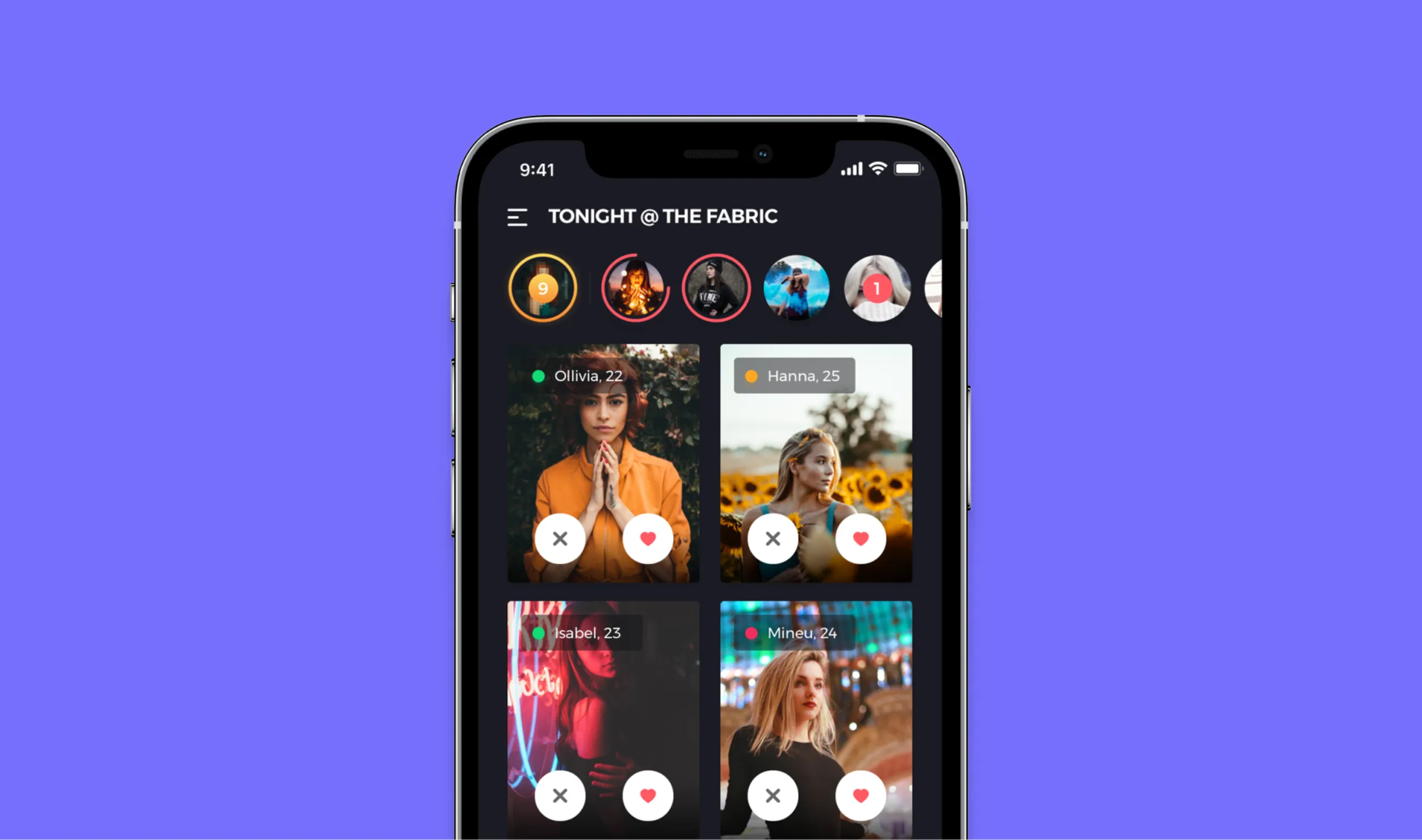
The app needed to cater to different audiences, including consumers and club promoters. Users had to be able to purchase tickets, reserve tables and drinks, and connect with other attendees through the app. For organizers and promoters, efficiency was crucial: they needed to manage supply and demand through a single platform. These diverse functions and interests required a clear flow and appealing design to ensure users could focus on their night out.
Solution
We started by conducting interviews with club promoters to understand their needs and pain points. Until now, they managed bookings through various chat groups, which was cumbersome. A single platform would significantly simplify their work.
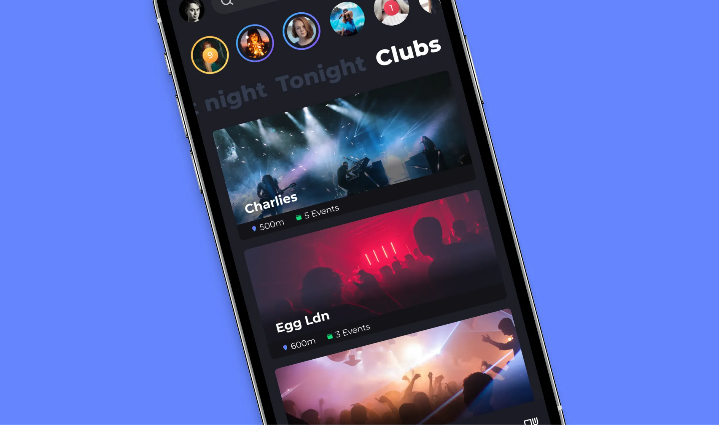
Based on these insights, we designed the app flow for users. We created different screens for features such as finding events and chatting with others. Since the app would primarily appeal to a younger audience, we chose a sleek and cool design. Given that the Wergo app combined features of different types of apps, we incorporated familiar elements to enhance usability.
Execution
We used tools like Figma for design and Marvel for prototyping. The team worked in sprints to quickly gather feedback and make iterations. The focus was on a seamless user experience and a visually appealing design that was both functional and attractive to the target audience.
Throughout the project, we had regular check-ins with Wergo to ensure their vision was followed and to make quick adjustments based on their input.
Results
The new Wergo app allowed users to easily discover events, buy tickets, reserve tables and drinks, and connect with other partygoers. For organizers and promoters, the app significantly increased efficiency, enabling them to better manage their events. The app was well-received by both users and promoters, significantly increasing user engagement and satisfaction.


