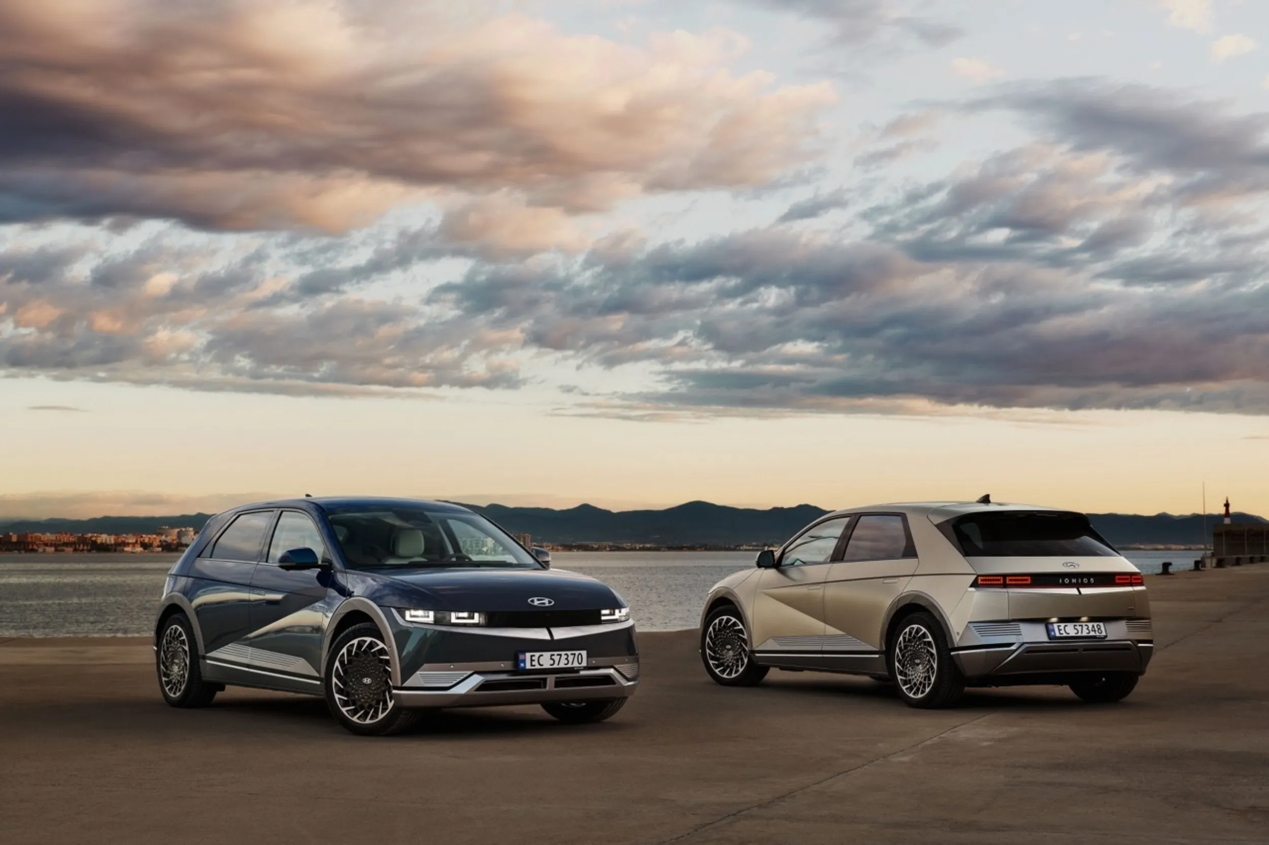
Challenge
The main challenge was creating a configurator where customers could easily select various options for the IONIQ5 and see the total price. The system also needed to work with a reservation system where a deposit was paid for the waiting list. It was essential that the configurator was accessible from any location, including on the go.
Solution
Our team began by analyzing the internal research results shared by Hyundai. Based on these insights and the briefing, we first created wireframes and then developed UI designs for both web and mobile devices.
In the design process, we focused on user-friendliness and transparency. We ensured a clear division of elements, with the car always visible with each selected change. The total price was constantly visible to prevent customers from encountering unpleasant surprises. The ‘next’ button, which only changed to ‘reserve’ at the end, was always visible to increase purchase convenience.
Execution
Thanks to the clear briefing and Hyundai’s research results, we were able to deliver the final designs within three weeks, almost as fast as the introduction of the IONIQ5 itself.
Throughout the project, we had regular check-ins with Hyundai to ensure their vision was followed and to quickly make adjustments based on their input.
Results
The new online configurator allowed customers to easily configure and reserve their ideal IONIQ5, no matter where they were. This significantly increased customer engagement and satisfaction. Hyundai was able to support the launch trajectory of the IONIQ5 without physical prototypes.
